News feed
Improved engagement and interaction of a specific user group.
Solution to boost news consumption among Gen Z users, recognizes the unique preferences and behaviors of this demographic.
TEAM
2 UX UI Designers
Senior UX Designer
DISCIPLINE
UX Design
UI Design
TIME FRAME
2 Weeks
Please note that due to the project's confidentiality, I am unable to disclose the client's name, logos, visual themes, or other specific details in this presentation. I have provided only a concise overview of the project in accordance with the non-disclosure agreement.
Background
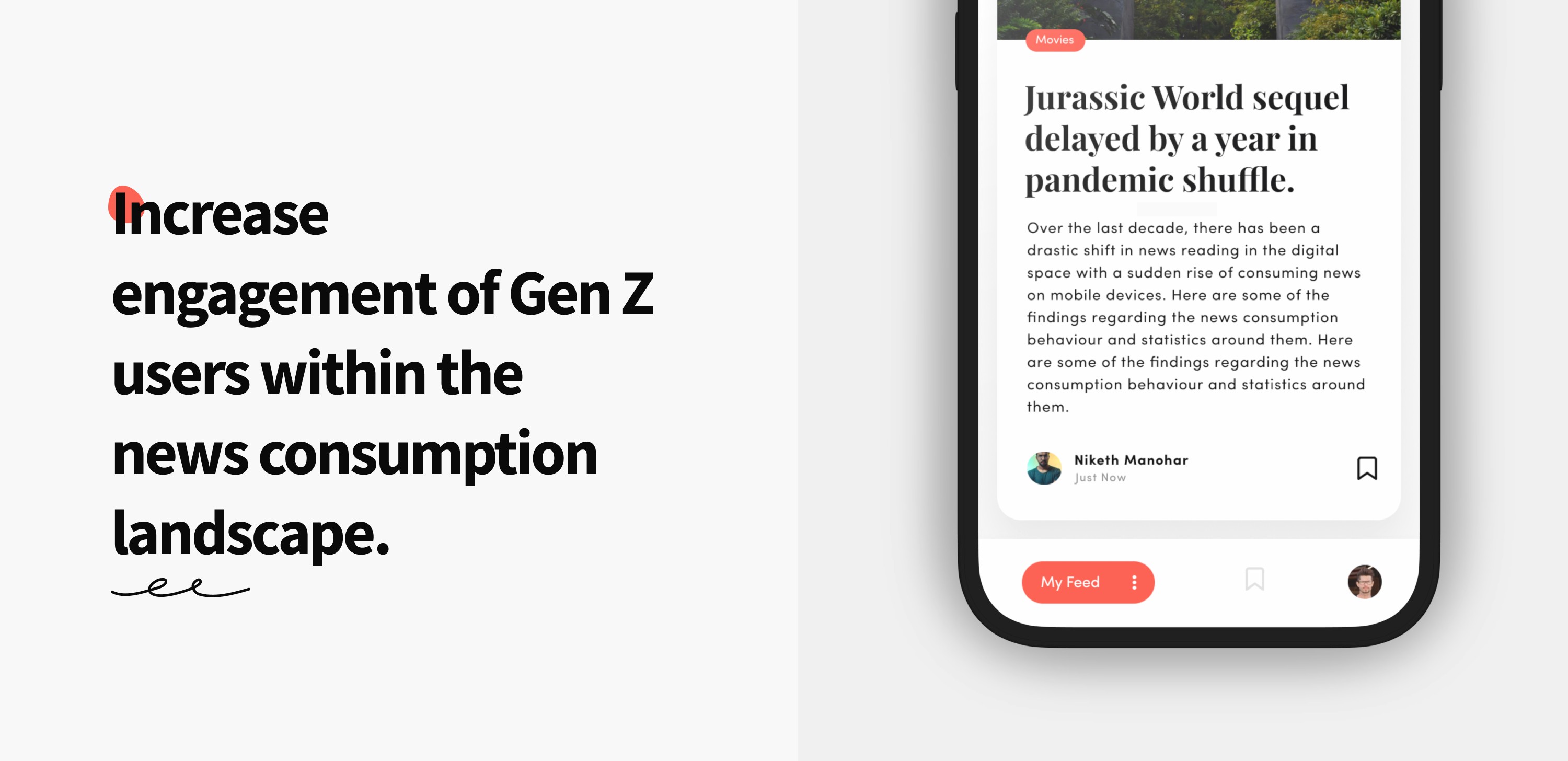
In 2022, our design agency was approached by the client with an exciting challenge: to provide a solution that would enhance engagement among Gen Z users within their news consumption landscape. The motivation behind this was from their observation of the absence of specific age groups following a comprehensive product update. Data collection methods included in-app surveys, social media insights, and analytics data.
My Role
Initially I managed the entire project, from conducting research to wireframes, while consistently receiving feedback from our Senior UX Designer and stakeholders. Later on, I teamed up with a Junior UI/UX Designer to finish the remaining tasks and successfully deliver the project.
Key findings from research
I got some interesting datas regarding the news consumption around the globe, in my country and the regional space.
Gen Z and Millennials are the top users for mobile subscription content, which is primarily streaming services not news.
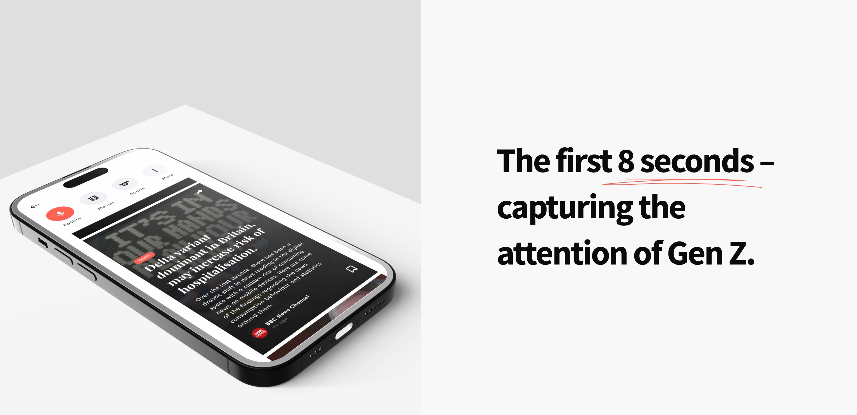
Average attention span of Gen Z individuals was only about eight seconds, four seconds less than that of millennials.
While Millennials tend to use Facebook, Gen Z is more tuned into apps like Instagram, Twitter, and Tiktok for their daily news updates.
Social media has even changed the relationship between journalists and audiences from a one-way, asymmetric model of communication to a more participatory and collective system.
The problem of absence of Gen Z in traditional news consuming landscape is a universal problem.
User landscape
Utilised user interviews as the primary method to gather more data about my target users. Through this process, I aimed to gather feedback to shed light on the following aspects:
How often do they consume news?
Through which methods and avenues do they consume news? This includes digital vs. print, social media vs. online news publications, on-the-go vs. stationary, etc.
Why do they prefer these methods?
What might help them become more engaged with the latest news?
These interviews aimed to provide valuable insights into the users' behaviours and preferences regarding news consumption. For a clearer understanding of the current platform, I conducted usability testing and user interviews with existing app users as well as potential target users.
Synthesising insights
From the desk research involved, user interviews conducted I organised the data and identified the common themes and relationships between my target users.
Attention span: They prefer content that is quick, visually engaging, and easy to grasp at a glance.
Relevance: the more relevant the content is to your interests, the more curious you become.
Amount of time: desire of spending the least amount of time in digesting the article’s content.
Sharable: Ability to share and showcase on their stories, without any friction, keeping them within their familiar social media ecosystem.
User patterns: Unlike static interfaces, they're drawn to those that offer interactive experiences.
Diving into solutions
We decided to develop a new application specifically tailored for this target audience. This new app can later be integrated into the conventional one as well.
So we arrived in our updated problem statement for the project. I believe I can solve this problem by Designing a news mobile application that consistently delivers:
Bite-sized articles tailored to the user's interests and context.
Customisable feed options allowing users to select their interests and preferred areas of news.
Emphasis on visual content such as pictures, videos, and infographics, with less reliance on text.
Integration with major social media platforms for easy sharing of articles as stories or posts.
Incorporating common interaction patterns like swipe, slide, and double tap for intuitive navigation and engagement.
The visual language aligns closely with the tastes and preferences of our potential user groups, diverging significantly from the traditional existing one.
Due to time constraints and urgency, we opted to skip the step of sketching, wireframing and evaluating them, and instead, I immediately began designing the high-fidelity visuals.
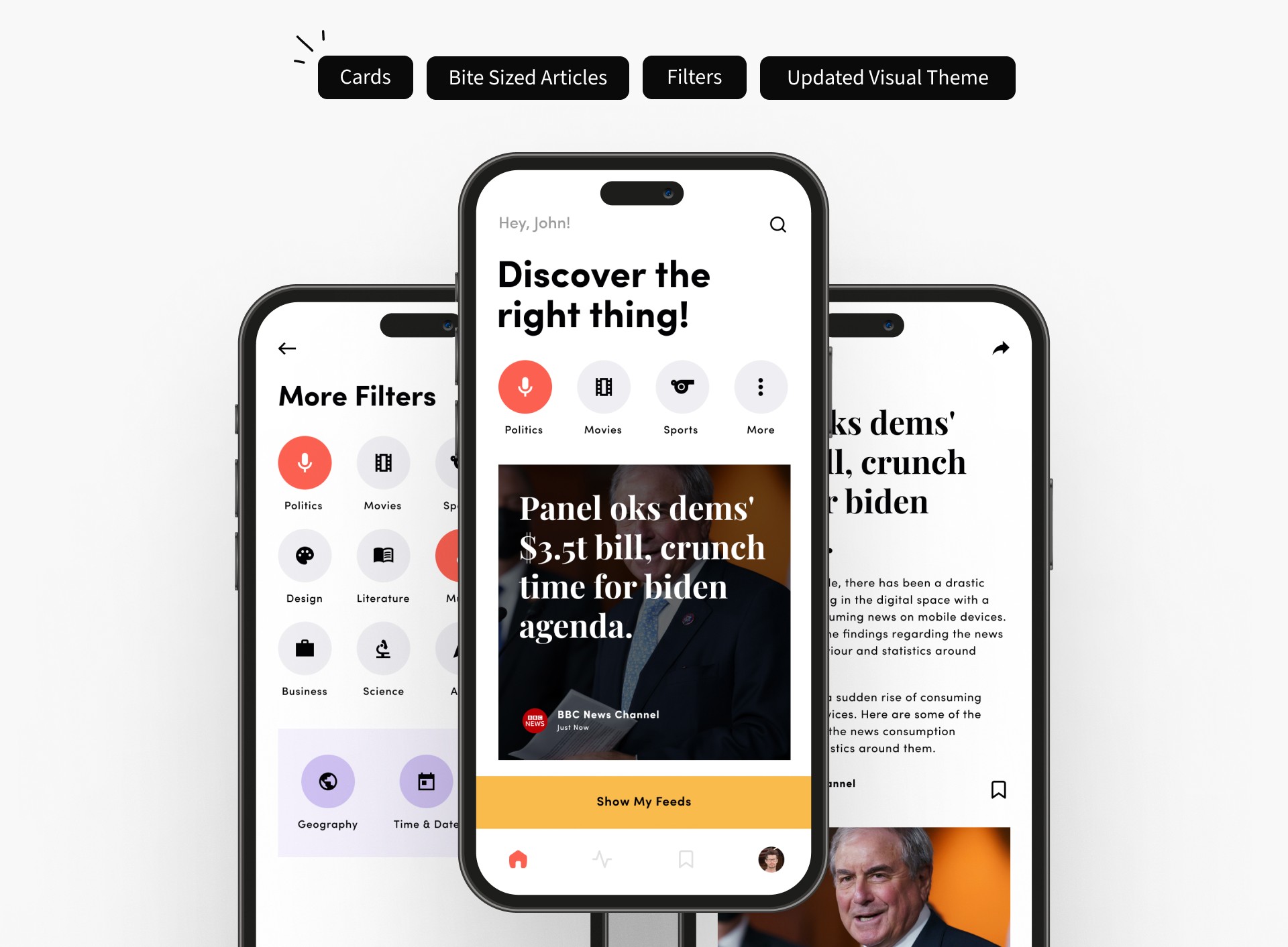
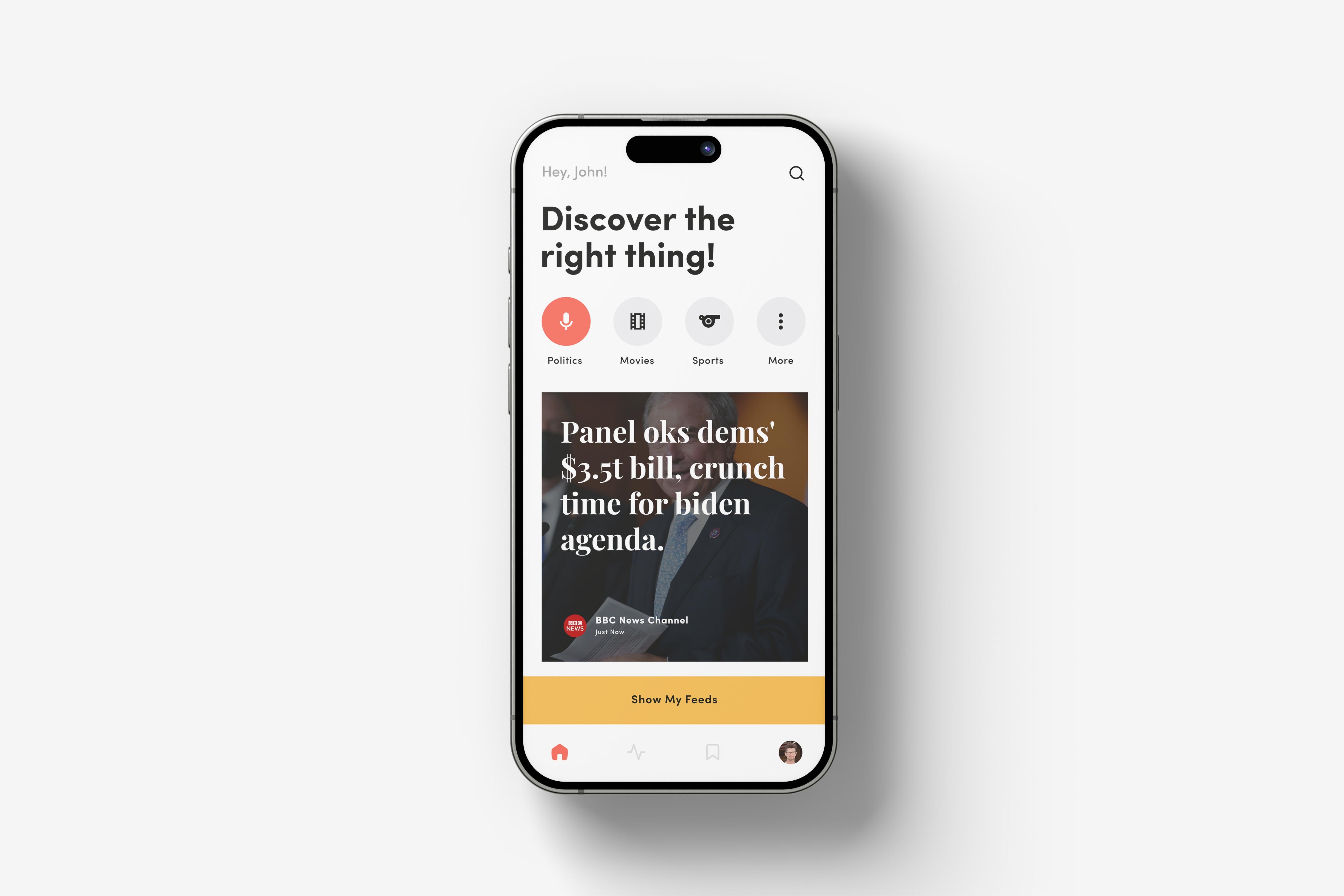
Here, articles are presented in bite-sized format within individual cards. Users can view each article as a card by scrolling up and down, and double-tap to open the main page for more details. From the home page, users can conveniently set their preferences based on their personal interests and relevance. Each article includes images and concise text for easy scanning. Additionally, I have included share and bookmark options for users to share articles or save them for later reference.

Unfortunately, due to the rush, I made a significant mistake by skipping crucial steps such as establishing Information Architecture, defining User Flows, and sketching and testing wireframes. As a result, during our team discussions and testing phases, I failed to identify existing problems. I was biased towards my initial insights and underestimated the importance of sketching, wireframing multiple solutions, testing them, and iterating as needed. This oversight has taught me the importance of thorough planning and execution in future projects.
What happened actually?
Before finalising the solution, I conducted usability tests with the selected target audiences as well as with a new group of potential users to mitigate any bias. The results and feedback from these tests forced me to reconsider the solutions I had initially framed. This iterative process allowed me to refine the design and ensure it better met the needs and preferences of the users.
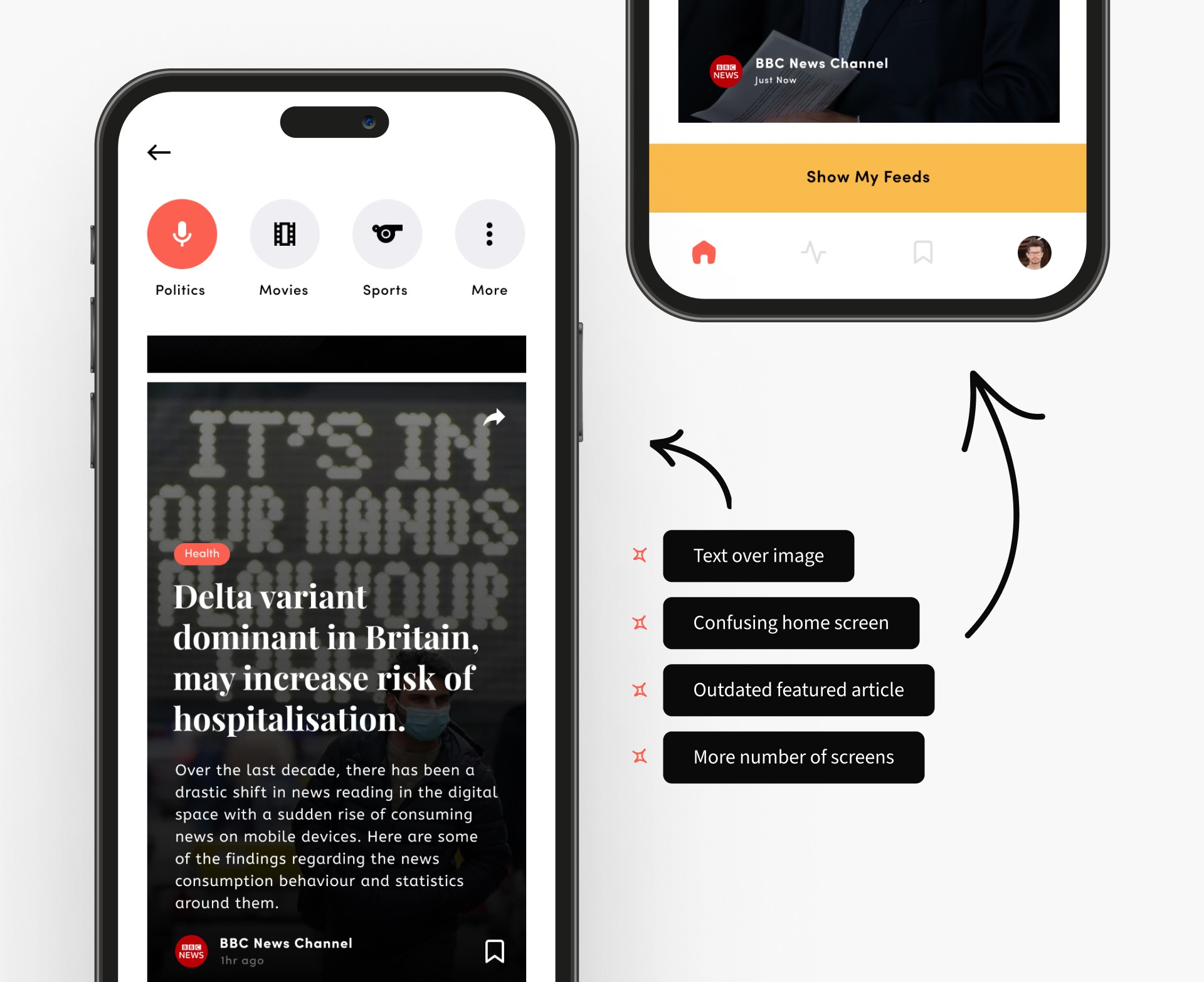
Problems with this solution
Placing text over the images led to difficulties in quickly scanning the articles. There was no significant change in scanning time compared to the previous conventional platform.
The home interface, featuring the most trending articles with category tabs and a navigation bar underneath, appears overwhelming for many users. The navigation seems to be confusing in multiple ways.
The feed often presents outdated or previously posted news due to the static nature of the filters.
Solution updated
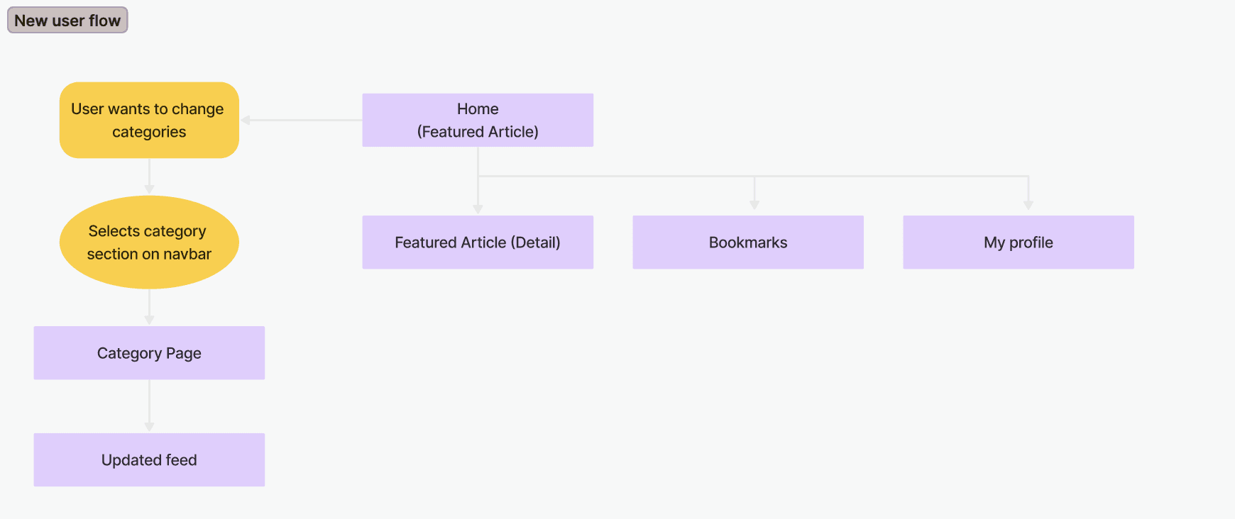
To avoid the mistakes I made earlier, I came up with multiple user flows and selected the best one to ensure simplified navigation and screens. Additionally, I created simple paper sketches to visually communicate the solution to the target users. In this process, I considered multiple solution concepts based on synthesised insights.
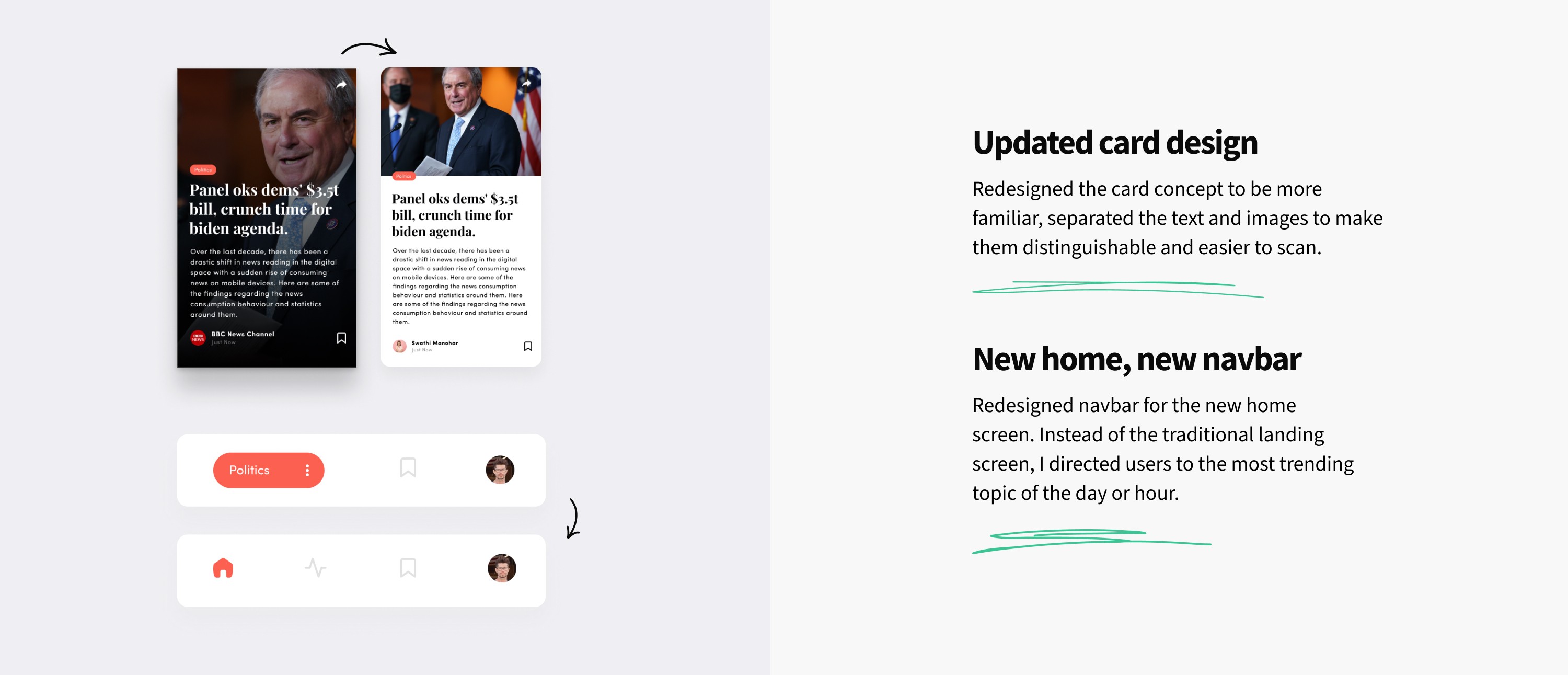
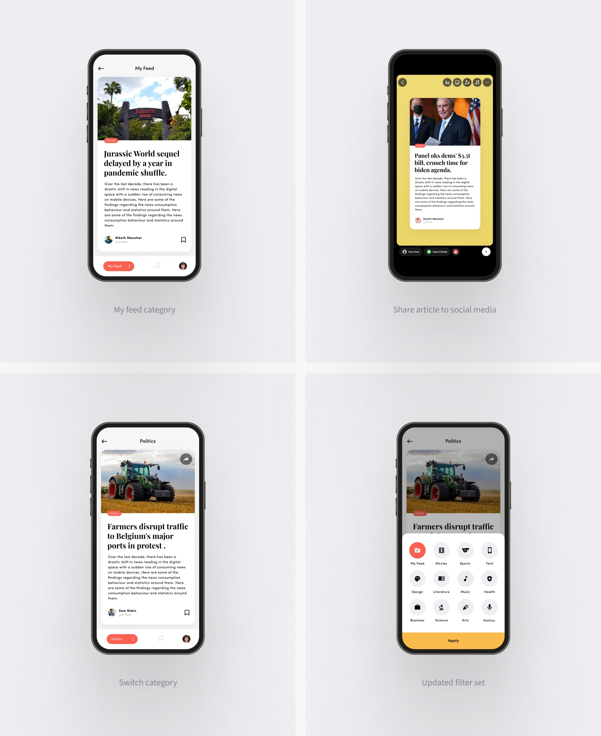
First, I redesigned the card concept to be more familiar, then I separated the text and images to make them distinguishable and easier to scan.
Instead of the traditional landing screen or home screen, I directed users to the most trending topic of the day or hour.
Implemented a "My Feed" option to provide users with more curated content. This feed is regularly updated based on topics the user searches, views, and shares.
Implemented an option to switch categories while browsing the feed in a different manner.
Validating and delivering designs
I conducted usability testing sessions on the app using the new designs and prototypes. Many of the issues identified were successfully resolved during these sessions. Users particularly appreciated the updated card concept and the approach of landing directly on the article.
Following this, I delivered the final screens and a complete prototype to the client.
My Reflections
There are a couple of things I'll take with me from this project
I've learned that it's crucial to understand time and budget constraints before attempting to solve problems.
I've realised that synthesised insights only provide direction and not a refined solution.
I've learned that framing multiple solutions and testing them helps significantly in eliminating bias.
Above all, I've learned to prioritise user feedback over our own conclusions and assumptions.
•
•
Behance
•
© Sagar Ajithkumar 2024

