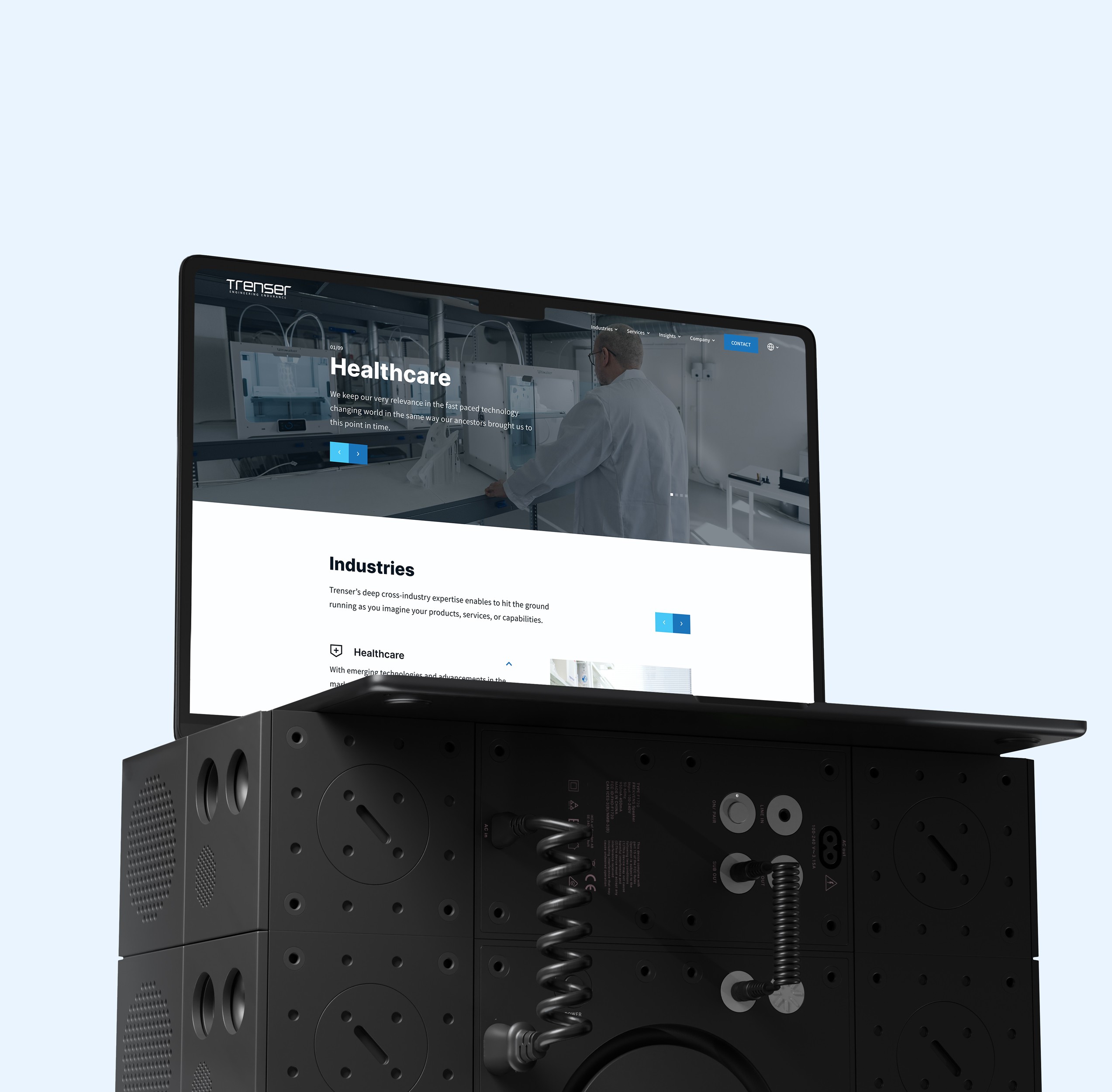
Trenser
Increased the conversion of the website by 19% through a high level overhaul.
Trenser is a pure-play technology services company fulfilling the software development needs of product companies across the globe.
TEAM
2 UX Designers
Product Manager
2 Developers
DISCIPLINE
UX Design
UI Design
TIME FRAME
4 weeks
Role & impact
As the design lead for this project, I led all design initiatives and collaborated with a product manager, business analyst, and developers. The redesign resulted in..
19% increase in average conversion rate.
Increase in average visit duration by more than 60%.
And managed to decrease the bounce rate by more than 27%.
2x faster learnability of the brand.
Why a redesign?
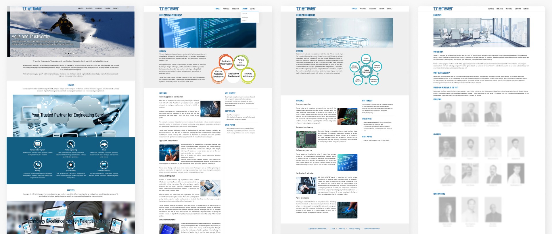
Trenser identified that lead generation through their website was significantly lower compared to other channels. They acknowledged that the current costs and efforts in marketing and lead generation could be more efficiently utilised with a compelling website in place.
Understanding problem
I tried to learn as much as possible about the problem space and the stakeholders involved. This involved:
Conducting interviews
Interviews with the management team and potential users to understand their perspectives on the problem space and the individuals involved.
Analytics data
Collecting existing data from Google Analytics, such as bounce rates, exit rates, drop-off rates, and time spent on every page of the website. This helped in understanding which products were performing well and where users were dropping off.
Conducting usability testing (task-based)
Usability testing on the website with potential users to understand the pain points faced by this user group.
Competitor analysis
Compiling a list of competitors and analysing how these brands operate within this space through their websites, helped to identify common themes and practices within the industry. Competitors included Global Logic, EPAM, GE, Cummins, Tata Projects, and Persistent.

Gathering insights
After collecting all the research data and analysing it, I have framed and prioritised the problems into a clearer and more actionable way:
Confusion and discontinuity in navigation
Users fail to complete most of the desired tasks, such as navigating to domains, industries, services. Another issue is the abundance of jargon on the website, which many users do not understand.
Absence of contact options
Contact options are crucial in this landscape, where competitors prioritise customer communication via the website. Here, users don't know where to go to contact the company.
Improper usage of components
There are various components on the website performing similar functions, leading to UI inconsistency and user confusion. For example, different types and colors of buttons and links.
Lack of motivation
Users, especially first-time visitors, complain of boredom and monotonous feel while navigating the website. Similar appearances of pages with different purposes and datas lead users to close the website after a few clicks without exploring further.
The website and brand lack credibility and recognition
Despite Trenser being an engineering service company with many years of experience, the website fails to establish clear communication regarding the brand experience, the experiences of previous customers, and quantitative data that highlights expertise and recognitions.
The platform appears to be providing outdated data and information
Given the company's domain and expertise, the platform fails to offer updated information regarding the new projects, research endeavors, and the evolving service landscape. Additionally, it lacks information regarding the team behind the brand and does not address current opportunities.
Not considering other market landscapes
It's crucial to address the Japanese market landscape on the website, especially given the company's significant inquiries from that market. (Note: The details about addressing the Japanese market landscape are omitted from the case study due to NDA).

Solutions
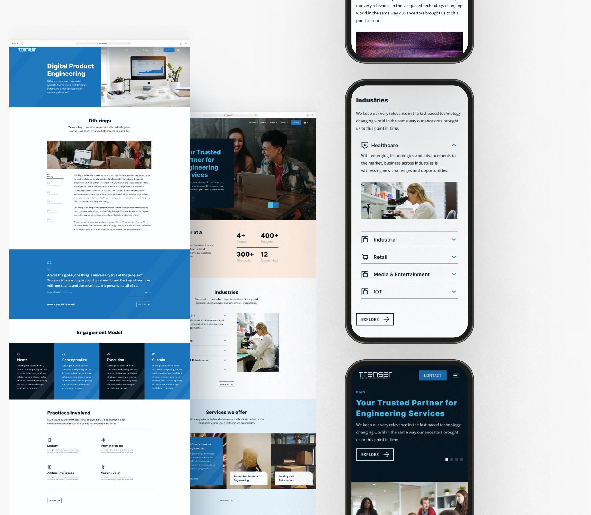
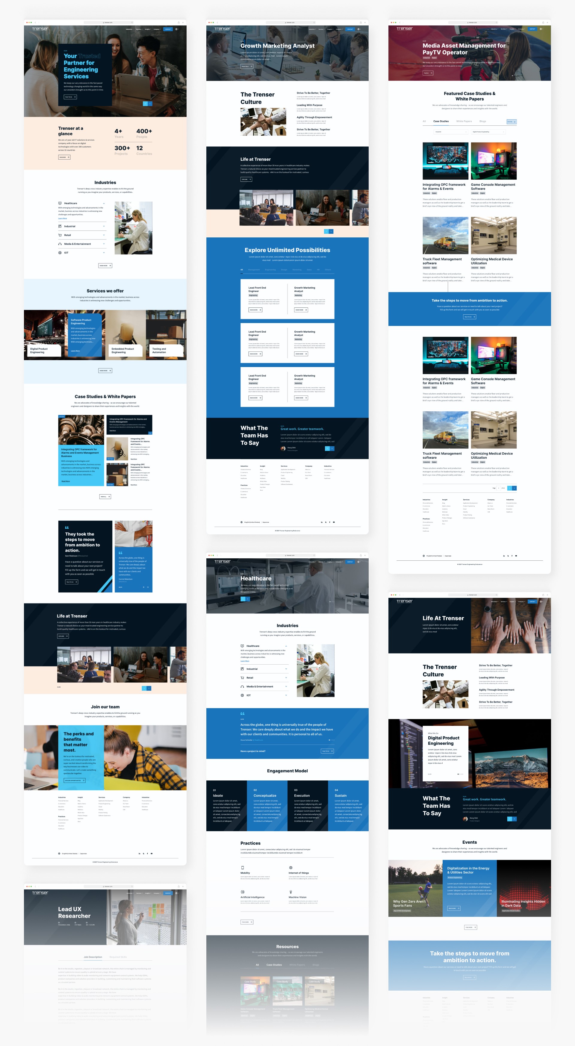
Based on the defined problems, I designed low-fidelity wireframes to set the layout and structure, validating ideas with stakeholders. Some screens went through multiple iterations after usability testing those with potential users. Additionally, we crafted interactive prototypes for some screens and sections. I worked on resolving the mentioned pain points and came up with potential solutions below:
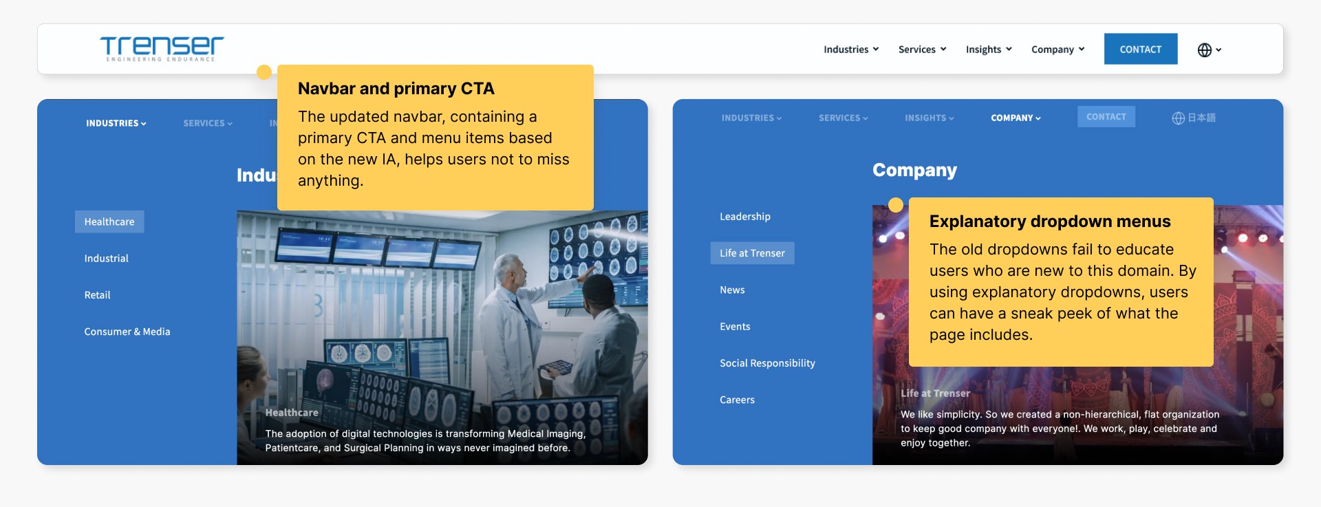
I started from the foundation itself, revisiting the current IA and making changes. I established a new sitemap based on prioritised features and content. Additionally, I implemented explanatory drop-downs with informative images, replacing stock images with real and humanised ones. Moreover, I collaborated with the copywriter to change the data presented on the website to something more conversational or easily understandable.
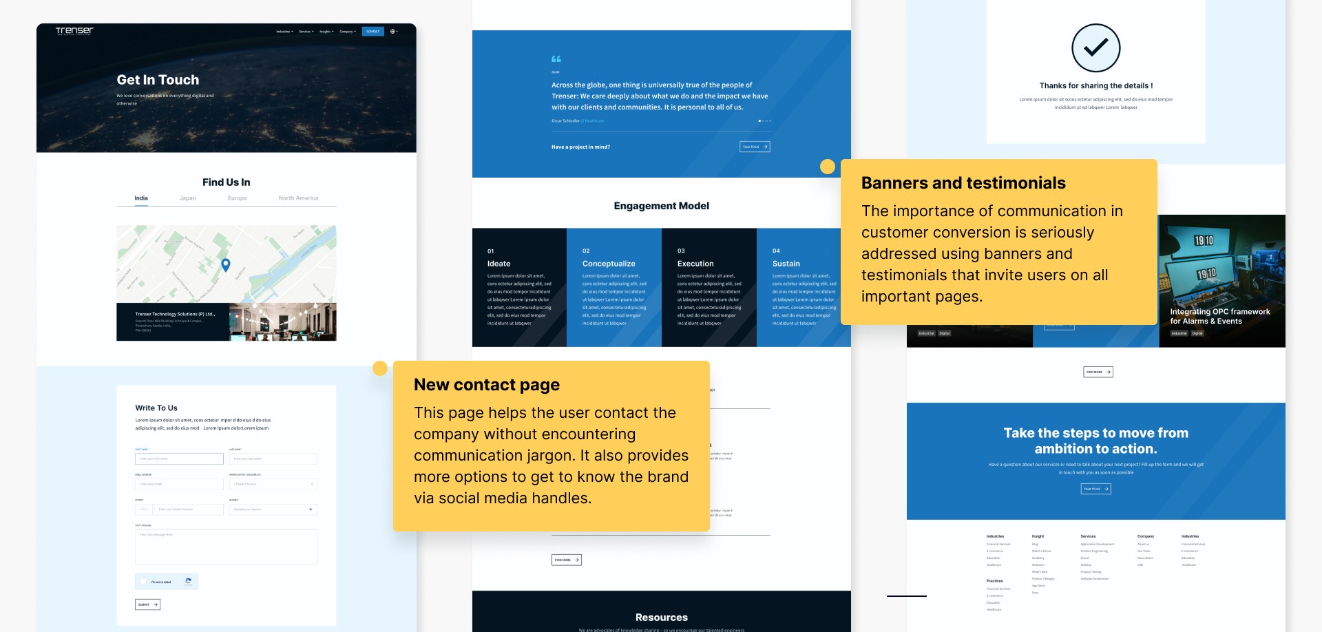
Introduced a fresh new contact page and an AI chatbot option for instant communication and inquiries. However, the company later omitted the inclusion of the chatbot due to budget constraints. All pages equally addressed the problem of communication through sufficient "Contact Us" and "Talk to Us" banners, as well as testimonials.
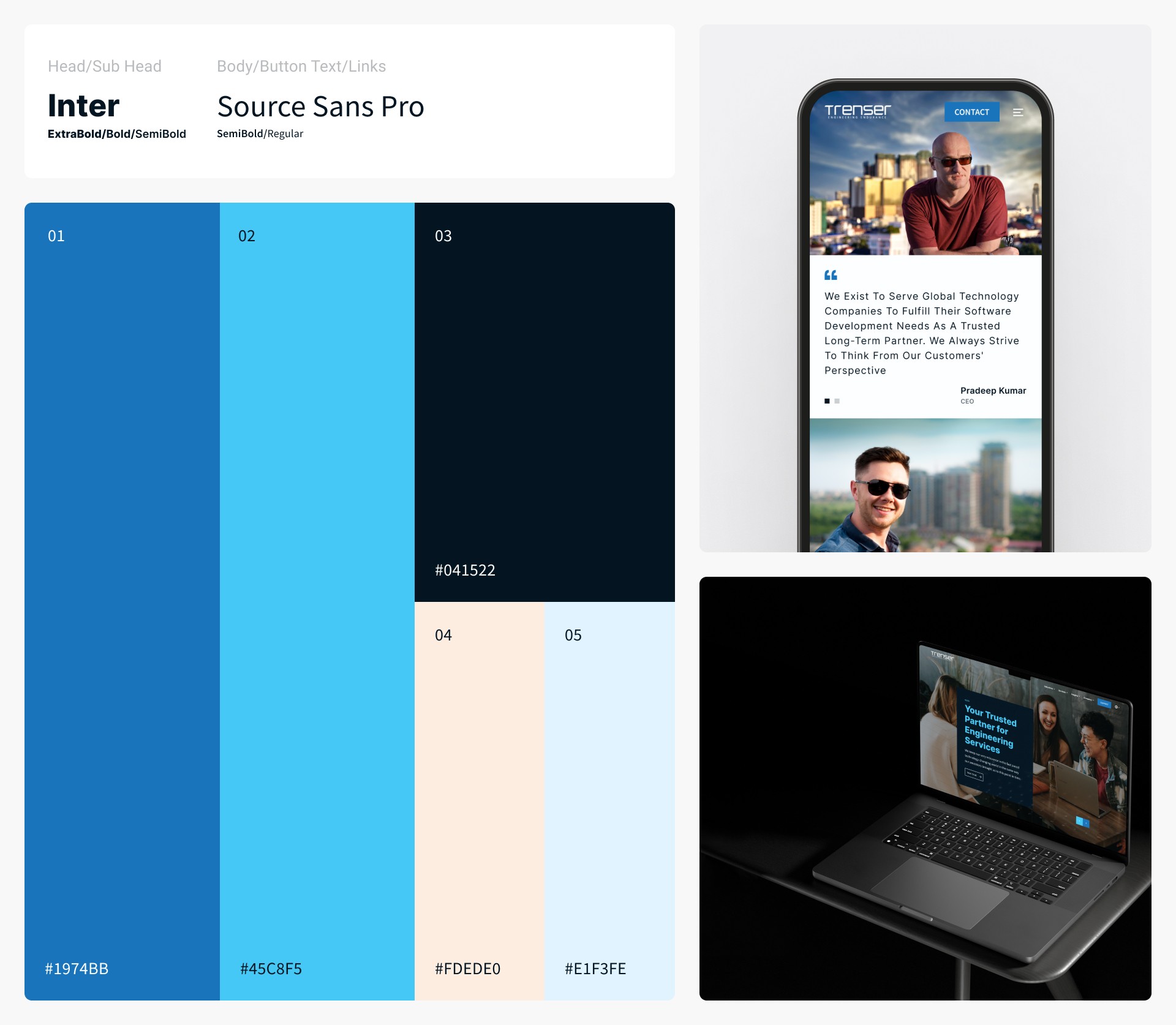
Utilising the newly created design system, we redesigned the entire application to ensure website alignment with the updated brand and consistency throughout.
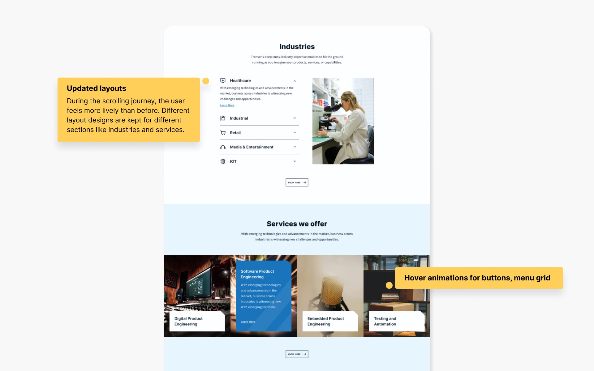
I introduced interactive menu sections for each category, replaced stock images with live ones, and incorporated scroll animations and hover animations to make the website more dynamic and engaging.
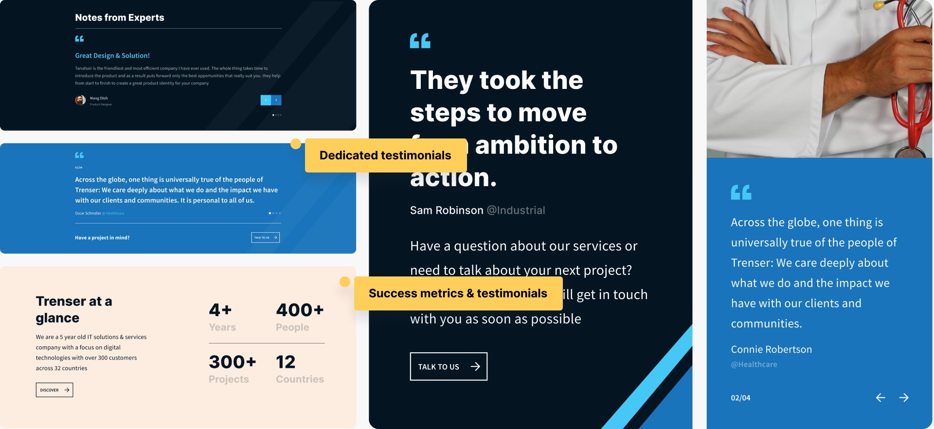
Establishing a strong online presence with clear communication, along with testimonials from previous buyers/customers about the brand's experience, and showcasing metrics regarding expertise, enabled the company to solidify its brand through its website.
Since the website operated 24/7, it was convenient to post news, research papers, updates on technologies, job openings, and events. Relevant content enhanced the perception of the company as a key player in its respective fields and portrayed its passion-driven approach, increasing engagement with investors and customers. Introducing new pages such as team, careers, news, and whitepapers further enhanced the website's functionality and appeal.
I provided a language switcher at the top of the navbar. The japanese version was different from the newly designed version because of the market priorities and landscape difference.
Validating & delivering designs
I conducted usability testing sessions again on the website using new designs and prototypes. I included both potential users and newly selected ones to avoid bias. Most of the issues identified were resolved during these sessions. Users also noticed and appreciated the updated website structure.
Afterward, we provided final screens, a complete prototype, and a useful component library. Since implementing the website's new design, we've received significant positive feedback through the NPS survey and data from tools like Hotjar, Analytics, and SEMrush, confirming the success of the redesign.
Process followed
The process followed in this project was the Double Diamond process. I believe that not every design process is perfect. Every project and institution are different, and design is not a linear process from A to B where we follow the steps to get there. The idea is not to follow the process like a recipe but as a map.
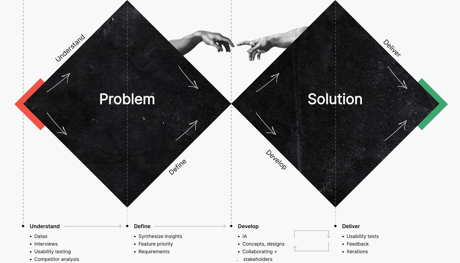
Having a process will provide structure and guidance, and knowing one can also help us to tweak according to our limitations or luxuries.
Experience
It was a great privilege to work with such a fun and driven team. I applied everything I learned in real-time, which made it a valuable learning experience. There are a couple of things I'll take with me:
Constantly working on omitting bias is important.
Design strategy is defined by how well you conduct your research.
Budget and time constraints need to be rechecked during each phase.
Collaborate with developers early and often.
•
•
Behance
•
© Sagar Ajithkumar 2024

